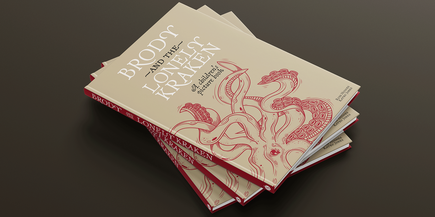
Sudtipos is proud to announce the commercial release of Lagarto, an award winning font designed by the master calligrapher, designer and illustrator Gabriel Martínez Meave from México.
—
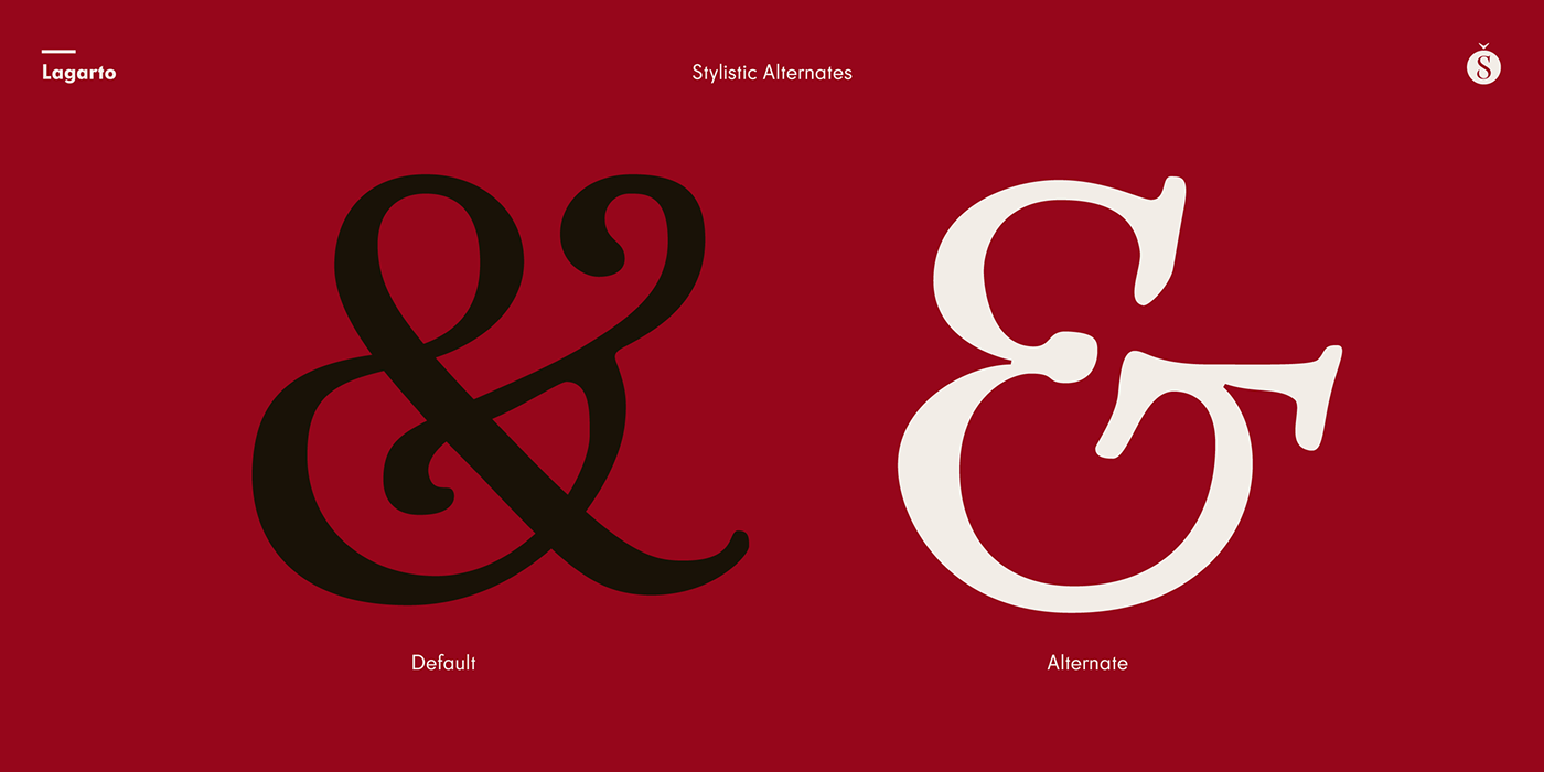
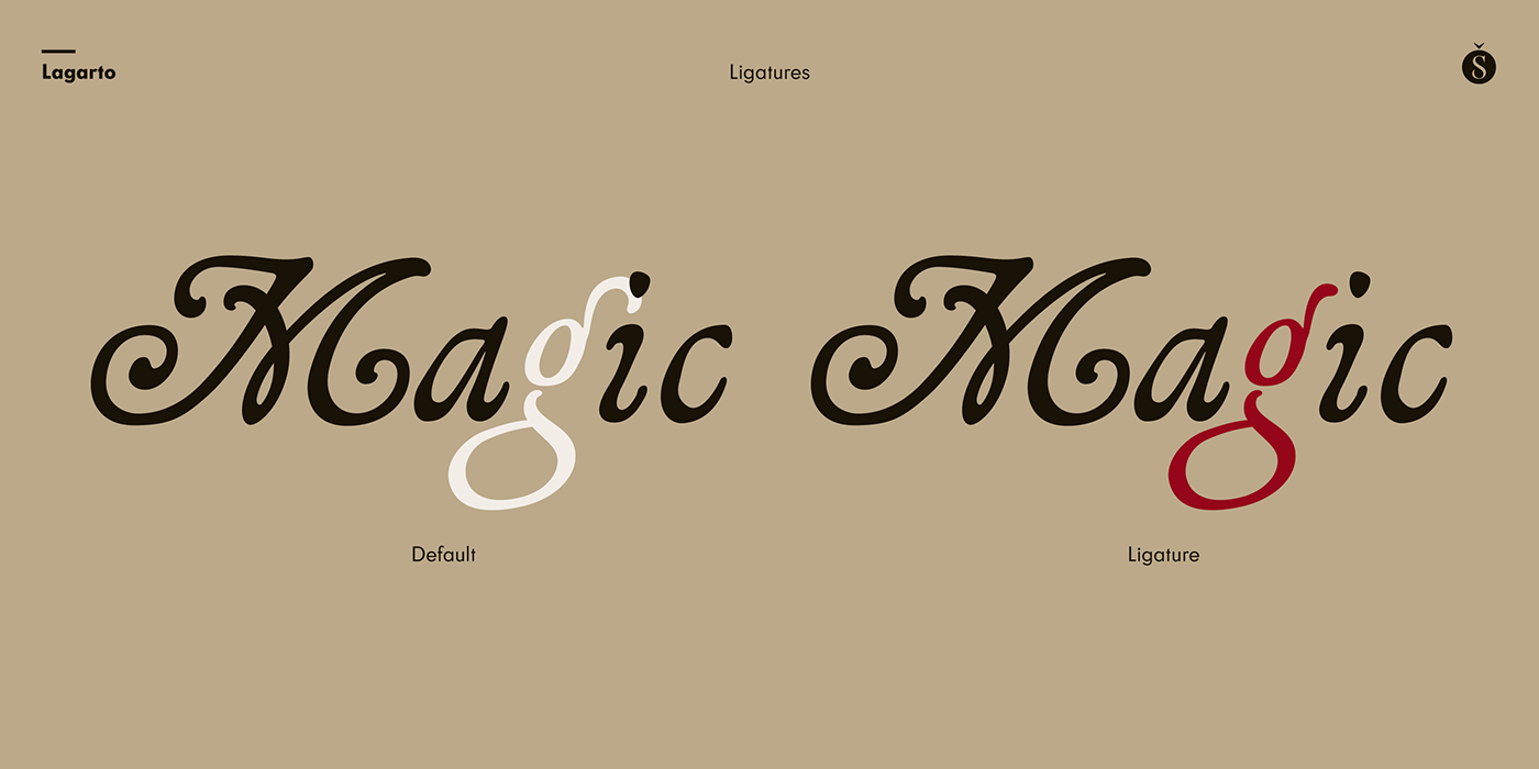
About Lagarto.
Some years ago, a good friend and typophile, Gonzalo García Barcha, approached me with the idea of designing a typeface for his editorial project Blacamán Ediciones. He had just came across an hitherto unknown manuscript by Luis Lagarto, a colonial illuminator and scribe, working in Mexico City and Puebla in the late 1500s.
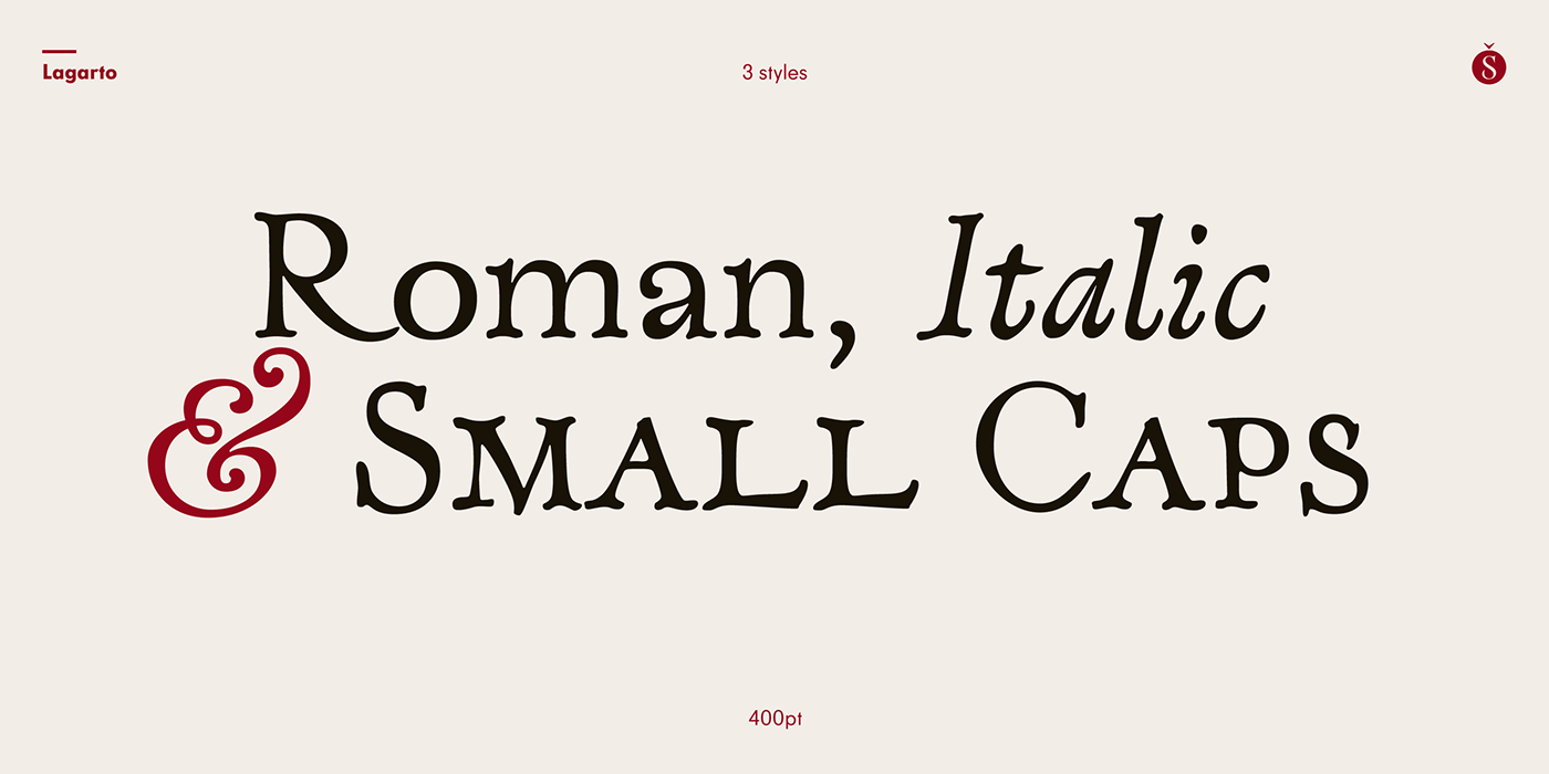
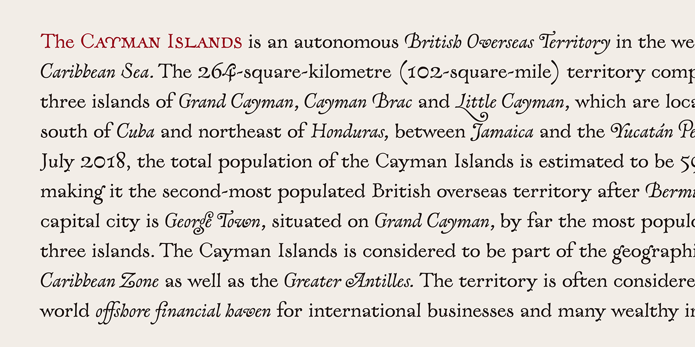
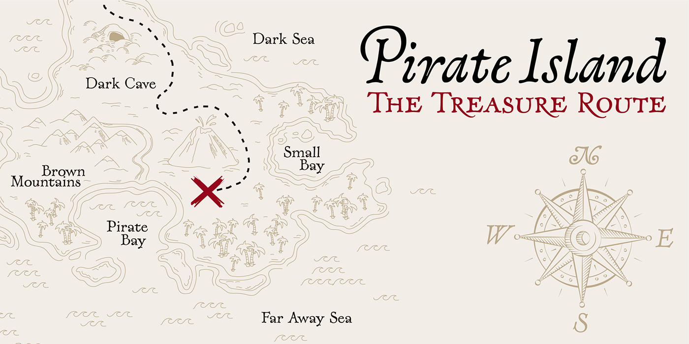
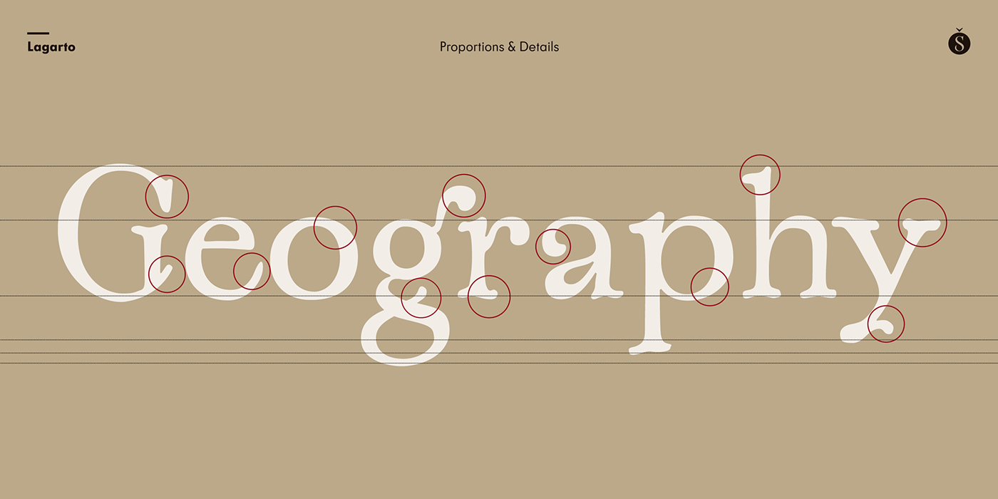
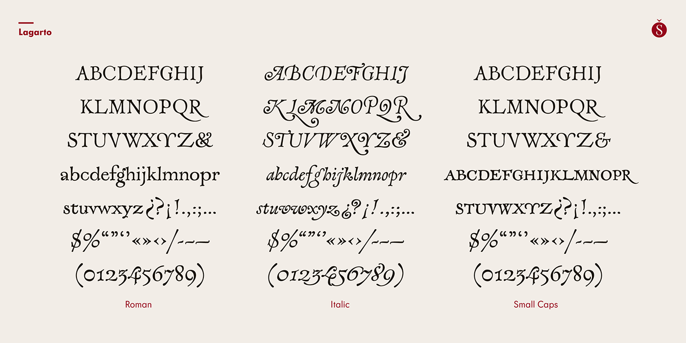
The manuscript calligraphy was incredible and stunningly original. It featured three different hands by the scribe, intermingled in the text: a kind of baroque «Roman» roundhand; a very ornate, lively «Italic»; and some sort of irregular, playful, even funny «small caps». All imbued with an eccentric, convoluted zest and vivacious rhythm.
Lagarto is the final result of translating these extraordinary hands into a digital type family. Since the manuscript had no numerals, math signs and many other characters now in use, part of the fun of the job was to infer them from the stylistic peculiarities of Luis Lagarto's calligraphy.
Lagarto received an Award of Excellence at the Type Directors Club of New York annual competition.
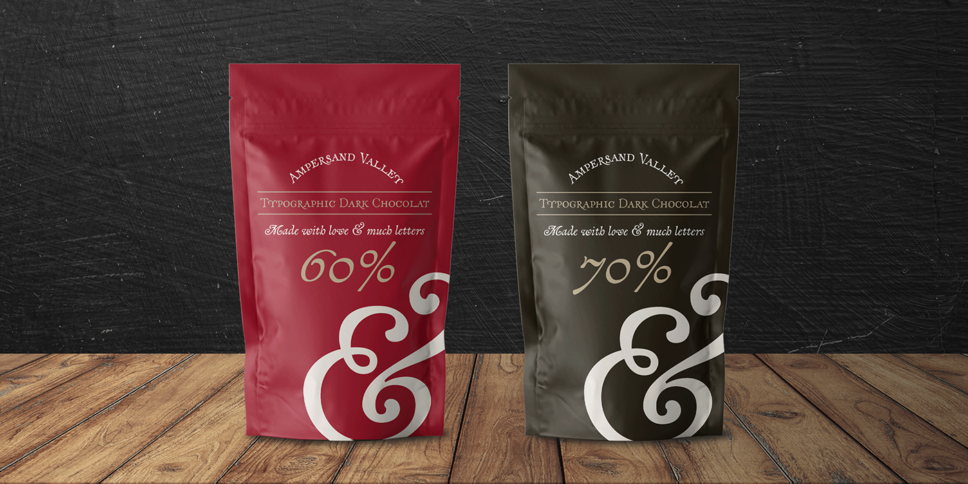
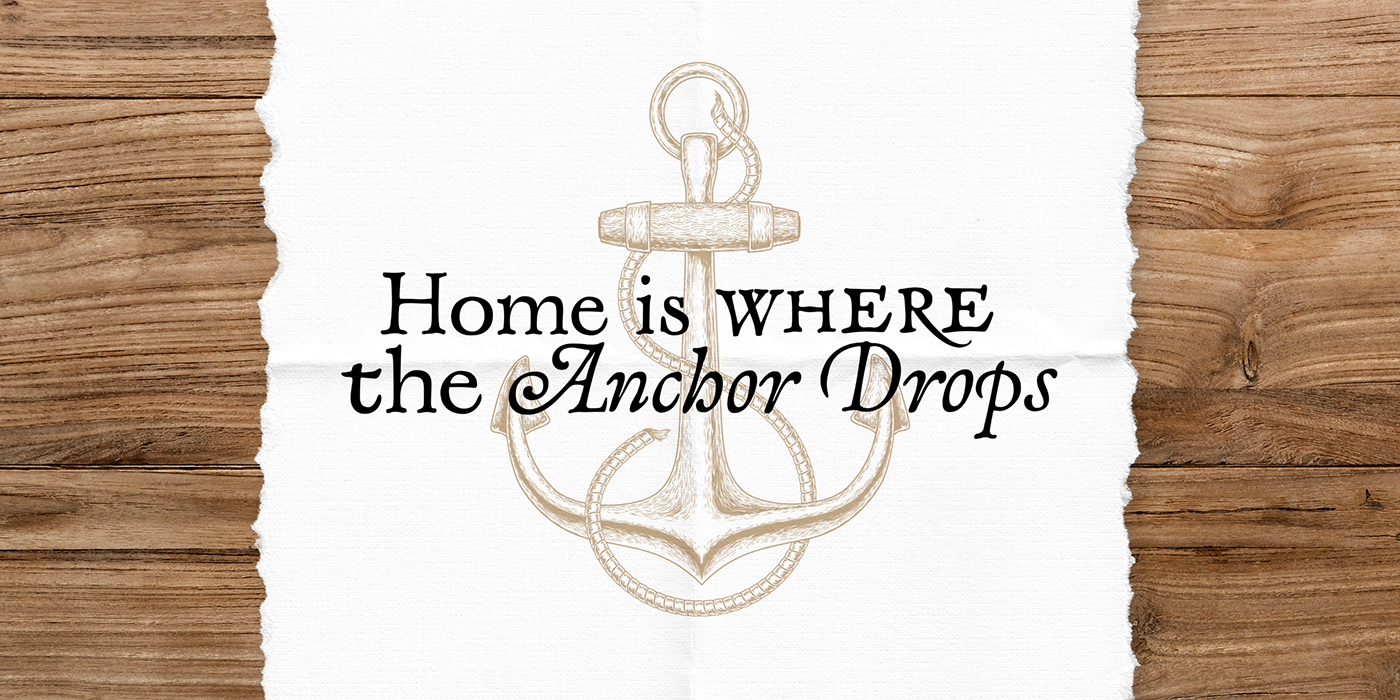
Available at Sudtipos.